Use a bar chart when you want to compare individual items. For example, compare ticket sales by location, or show a breakdown of employees by job title.
Learn how to add & edit a chart.
How to format your data
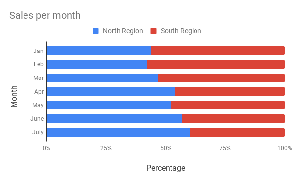
- First column: Enter a label for each row. Labels from the first column show up on the vertical axis.
- Other columns: For each column, enter numeric data. You can also add a category name (optional). Values show up on the horizontal axis.
- Rows: Each row represents a different bar in the chart.
Tip: If the chart doesn’t show the data on the axis you want, learn how to switch rows and columns.
Examples


Other types of bar charts


Customize a bar chart
- On your computer, open a spreadsheet in Google Sheets.
- Double-click the chart you want to change.
- At the right, click Customize.
- Choose an option:
- Chart style: Change how the chart looks.
- Chart & axis titles: Edit or format title text.
- Series: Change bar colors, axis location, or add error bars, data labels, or trendline.
- Legend: Change legend position and text.
- Horizontal axis: Edit or format axis text, or reverse axis order.
- Vertical axis: Edit or format axis text, set min or max value, or log scale.
- Gridlines: Add and edit gridlines.